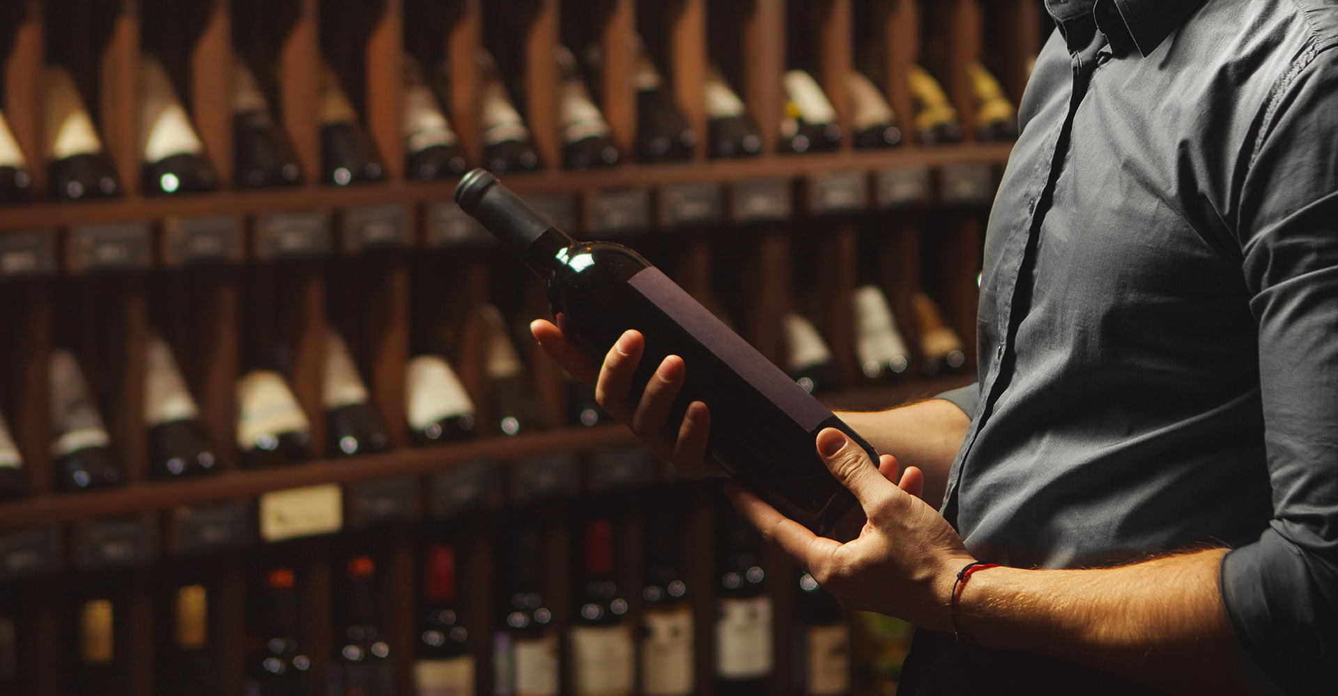
Let’s face it, most of us have made at least one wine purchase based on a pretty label. Maybe it had a cheeky animal on it. Maybe it looked posh enough to impress your in-laws. Maybe it just had gold foil. Whatever the reason, you’re not alone. Turns out, that bit of paper wrapped around the bottle is doing more heavy lifting than a sommelier at a wedding.
Welcome to the world of the wine label: part art, part psychology, part Jedi mind trick.
1. That Label? It’s Not Just Decorative
According to multiple studies, up to 85% of people buy wine because of the label. Not the grape, not the vineyard, not even the price. Just how it looks. In a wine aisle that resembles a chaotic gallery of glass and corks, this isn’t surprising.
Picture the typical shopper: standing paralysed in front of the “Wall of Wine,” clutching their trolley like a lifebuoy, with seven seconds to make a decision. That’s less time than it takes to open a screw cap. The brain takes a shortcut, and the label is the satnav.
2. Visual Cues: Fancy Fonts and Foiled Tricks
Wine labels don’t just say things, they signal things. Think of them as Tinder profiles for bottles.
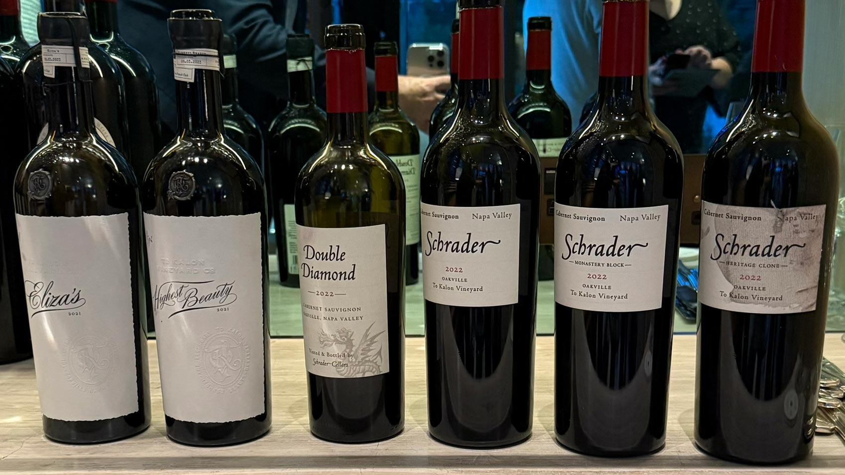
- Black & Gold? Sophistication. Probably expensive. Possibly judging you.
- Bright colours & animals? Fun! Casual. You’ll probably drink this at a BBQ and call it “surprisingly nice.”
- Serif fonts? Heritage, class, probably French.
- Sans-serif? Modern, chill. Probably from California or with a Spotify playlist.
Oh, and texture matters too. A nice embossed label? That’s like a firm handshake for your fingertips. You’re touching quality, even if it’s under £10.
3. Millennials vs Boomers: A Label Divide
Millennials want Insta-worthy bottles with personality, stories, and sustainability. Boomers want heritage, legibility, and something that looks like it belongs in a mahogany cabinet.
That’s why a wine that looks like a tattoo parlour designed it might sit next to one with a coat of arms and parchment script. Both are selling to their tribes. Both are right.
4. Retailers Are In On the Game
Private label wines (hello, M&S!) are thriving. Why? Because if they can make a wine look like a £20 bottle, while selling it for £8, you’ll bite. Literally.
These own-brand beauties mimic everything from typography to label texture, creating supermarket shelf doubles that feel premium without the price tag. It’s design-as-deception. Or as marketers call it, “positioning.”
5. The High Stakes of Rebranding
Remember when Tropicana redesigned their packaging and lost $30 million in two months? Wine isn’t immune. Change the label too much, and your loyal customers won’t recognise you. You’re not just changing the look. You’re breaking the memory loop. The visual cue that says: “Yes, this is the wine you liked that time with the lasagne.”
6. Labels of the Future: Less Paper, More Pixels
QR codes, AR animations, transparent calorie counts, NFC chips—the label is evolving. Soon, your bottle might tell you where the grapes were grown, what Spotify playlist pairs with it, and whether it’s vegan. All before you even uncork it.
In short, labels are no longer the silent salesman. They’re screaming into your shopping basket, whispering sweet nothings to your subconscious, and quietly driving a multi-billion dollar market.
Next time you choose a bottle, take a moment. Is it the wine you want… or just the label you love?
Cheers to knowing the difference.


